Diametric Health Tracker Dashboard
Role
UX/UI Designer – Research, Wireframing/Prototyping
Platform
Web Dashboard
Tools used
Figma, Adobe InDesign, Adobe Illustrator
Duration
1 week
DiaMetric is a health tracker platform for people with type 2 diabetes or at risk of developing it. The goal was to design a dashboard that provide clear, useful insights into key health data, including waist size, sleep patterns, blood pressure, glucose levels, and calorie intake. The design process involved researching competitors, sketching different layout ideas, and creating a high-fidelity prototype. The focus was on ease of use, visual clarity, and effective data presentation to help users track their health more efficiently.
Streamlining Health Tracking
Managing type 2 diabetes or preventing its onset requires consistent tracking of key health metrics. Many existing health dashboards can feel overwhelming or lack clarity, making it difficult for users to focus on what matters most. DiaMetric was designed to address these challenges by offering a clean, intuitive interface that presents essential health data in a way that is both accessible and easy to understand. Through competitor research and user-centered design, the goal was to create a dashboard that simplifies health management while maintaining accuracy and usability.

mySugr
The mySugr app has useful tracking features and gamification, but its visual design feels a bit old-fashioned compared to newer apps. The icons and color choices don't have the fresh and modern look that many users may expect. This can make the interface feel cluttered and overwhelming. The app’s low contrast between some text and backgrounds can make it hard to read, especially for users with visual impairments. Improving the contrast and updating the design with cleaner, more modern visuals would make the app clearer and easier to use.
My Diabetes Connect
My DiabetesConnect seems to be a useful app that help users track important diabetes information. Many users seems to like the app because it is simple and easy to use. Setting reminders and logging data is straightforward,
making it easier for users to stay organized and manage their health. This app also feels a bit cluttered and uses low contrast colors, which can make it hard to read for people with visual
impairments. The use of red and green colors is notthe best choice for guidance for people with color blindness. Higher contrast and a cleaner, more modern look would make the app clearer and more appealing.
Diab Trend
DiabTrend is providing useful features, but its visual design could benefit from some improvements. The interface feels a bit cluttered, which might make it harder to navigate smoothly. The choice of colors in text and background has low contrast and can be hard to read. The app’s tracking features seems to be strong, but some users mention that it takes time to learn and navigate. The
layout and features can be confusing, especially for older users or those who prefer simpler health-tracking apps. There are also mentions of some integrations and prediction tools not being reliable.
I did a quick competitor research of some competitors in the diabetes tracking app market, where I have fokused on visuals and user reviews. Hereare some observations:
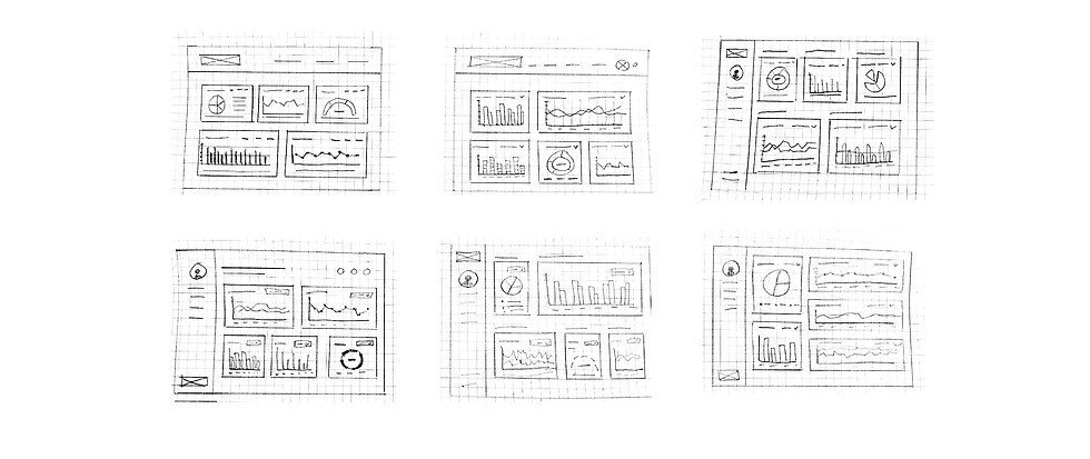
Design Process
I began with hand-drawn sketches to explore different layouts, focusing on clear information organization and a logical user flow while simplifying and refining ideas before moving to wireframes.
Visual hierarchy
The most important information is shown clearly and stands out. I used size, color, and placement to help users quickly spot the most important details.
Clarity and simplicity
To avoid clutter, I kept the design simple and clean. The charts are chosen to show data in a way that is easy to understand at a glance. Clear headings and labels make the information easier to read.
Accessibility and contrast
I used high contrast colors to make sure text is easy to read, also for people with visual impairments. The colors and design choices follow Web Content Accessibility Guidelines (WCAG).
Consistency
The dashboard has the same fonts, colors, and details throughout. The consistency makes the interface feel familiar and easy to navigate. Optimal sized text ensures readability.
User focused design
The dashboard is designed with the users in mind. The charts shows data in a way that helps them track their progress in a simple way. For example, the waist circumference chart includes a goal line for easy comparison, and mouse over interactions allows users to see exact numbers for more detailed insights.
Interactivity and feedback
Mouse over notes show precise data and give users immediate feedback. This helps users easily interact with their data and understand their health trends better.
When designing the dashboard, I had several design principles in mind to create a clear, easy to use, andaccessible interface:
Color & Typography
I focused on creating a clean and modern look by choosing clear colors and a simple, readable font. This contributes to making the dashboard clear and simple, and also help differentiate from competitors.
Color palette
The selected colors are used sparingly to reduce
visual clutter and enhance readability. The combination of the colors creates a balanced modern interface, supporting accessibility and ease of use.
Typography
The chosen typeface, Inter is modern, clean, and has high readability. It has balanced letter shapes and good spacing which make it suitable for both headings and body text.

Accessible Color Contrast
To ensure that the text and background colors meet accessibility standards, I used the Contrast Checker tool from Coolors. This helped verify that the contrast between text and background colors meet the WCAG (Web Content Accessibility Guidelines) requirements, and ensured that all text is accessible, making the dashboard easier to read for users with visual impairments or those who may have difficulty reading low-contrast text.

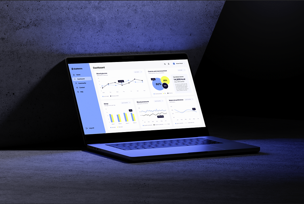
The High-Fidelity Prototype
The high-fidelity prototype of the DiaMetric dashboard is designed for clarity and ease of use. With a clean, modern layout, it prioritizes readability and ensures users can access key health insights without unnecessary complexity. Thoughtful typography and a minimalistic color scheme enhance usability, making the dashboard both functional and visually engaging.
For a detailed look at the design choices, explore the annotations on the Figma board.

Key Learnings & Next Steps
When designing the dashboard, I focused on a modern, user-friendly interface that makes health metrics easily accessible and understandable.
Key Learnings:
-
Understanding User Needs – Many health apps overwhelm users with data. I prioritized a clean, uncluttered design that highlights key information.
-
Accessibility Considerations – Used tools like Coolors Contrast Checker to ensure readability, maintaining a minimal color palette with high contrast.
-
Interactivity & Feedback – Implemented hover functionality for charts, allowing users to access details without cluttering the interface.
-
Typography & Visual Hierarchy – Selected a versatile font and consistent text structure for easy readability.
-
Clean, Minimal Design – Avoided unnecessary decoration, focusing on a structured, modern layout for a seamless user experience.
Next Steps:
The next phase involves user testing to gather feedback on usability and ensure the dashboard meets user needs. Insights from testing will help refine the design for even better accessibility and engagement.
